Showing posts with label foliage. Show all posts

Saturday, 31 October 2015

Quenington, Gloucestershire

It's been getting noticeably difficult to draw on our last few excursions, what with dingy weather and shortening days. So B and I thought we'd make a final trip for the year to a few further-afield, but bound-to-be-good sites. I'd scribbled some notes on a bit of paper and we leapt into the Van. It always feels like more of an expedition if you take the Van.

Having arrived at Quenington, anticipation was high but we consumed some snacks to raise blood sugar for the drawing ahead. Nevertheless I was still confused when we stood outside the amazing doorway - weren't there supposed to be beakheads? Our favourites the beakheads?  The door was amazing though - absolutely huge and with so much decoration it was as if someone had gone a bit mad and couldn't stop adding to it.


There was too much to draw and I felt overwhelmed. I was rather taken by this foliage-spewing animal (a green animal as opposed to a green man, you might say). There were also some borders of big flowery designs:


As we read the information booklet from inside the church, I realised that there were beakheads after all. But they were around the doorway on the other side of the church. OMG there are TWO DOORWAYS?! We walked round to be met by an equally elaborate and quite crazy sight. How can one church have so much Romanesque marvellousness? It was entirely overwhelming. I could only draw a little more. You could come back here every day for a year. 
The tympanums (tympani?) both had human figures on them. But when faced with so many creatures and excellent patterns, who needs Romanesque people? I think I know where my current interests lie (and this was confirmed later at Southrop).


Saturday, 27 September 2014

Winterbourne Monkton, Wiltshire

The font at Winterbourne Monkton has been on the fringes of my awareness for a long time because of its mysterious figure and proximity to the stone circle at Avebury. It was a lot bigger and chunkier than I was expecting. The carving is very detailed but forthright.

Drawing of the Norman font at Winterbourne Monkton, Wiltshire

A friendly woman who was arranging things for the Sunday service told me the church had been a 'slipper church', meaning that pilgrims took their shoes off there and continued the rest of the way barefoot. I'm not sure where, she said Santiago de Compostela but I think that was probably a bit optimistic. You'd think maybe Glastonbury, as that's a bit nearer (and the 'Monkton' of Winterbourne Monkton does refer to it being owned by Glastonbury Abbey). All the same I hope the pilgrims took their shoes with them (ew). 

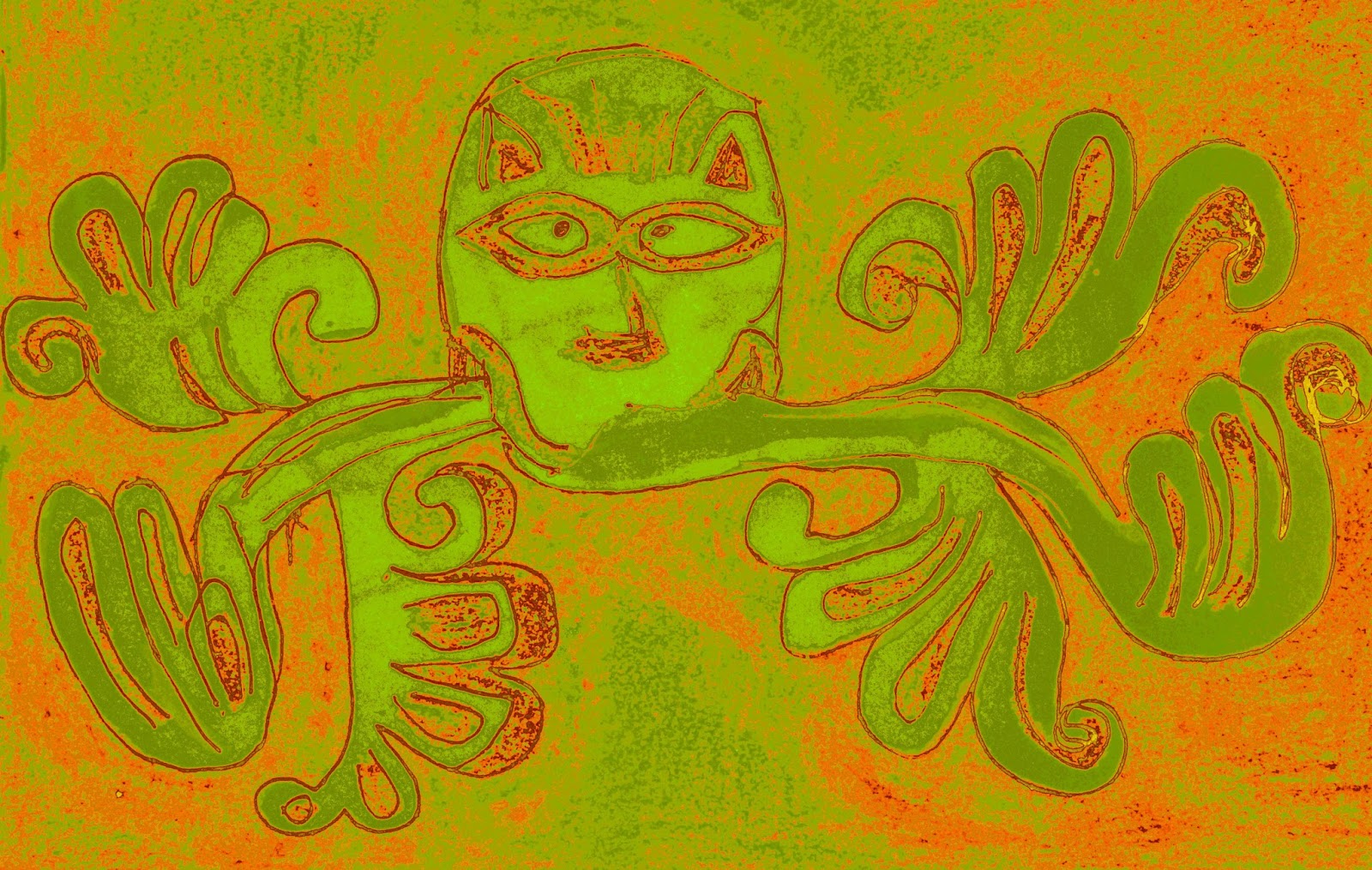
Here's the figure. Some people have wanted to imbue it with Sheela-na-gig style symbolism. But there's nothing to really say if it's even male or female.


The head is almost horned at the top, and it's certainly a funny shape. It's hollowed out and there's no trace of those big eyes you get on Norman sculpture. The arm on the left has got a few extra bends in it compared to mine. And that makes me think it could even be serpenty (with devillish connotations) or maybe foliage. Or maybe the carver just got a bit confused, but wanted it to link up with the big zigzaggy chevrons. Who knows. The hand on the right looks curled round at the wrist.

The legs and feet are more delicately done. I think you can even see toes on one. They both fit nicely into the dips formed by the top of the 'trumpets'. Around the rest of the font those dips house a little foliate design. And that's why I'd say whatever's between the legs is probably similar foliage, rather than being anything indicating the figure's gender.

As the churchgoer pointed out, you can see traces of a lot of paint on the font. And you can see that the carvings were rather hacked about when the paint was removed. It must have looked a bit crazy when it was brightly coloured. But I think I prefer the more minimalist look - the lovely geometric carving doesn't need any extra fuss for me. I wonder when the colour was put on though, was it original?

Here's a nicely contrasty picture of the trumpety motifs and the nailhead between them. And a triple chevron band. Mmmm.


One more thing about the location: I drove into the village over a bridge crossing a wide dry ditch. Dry at this time of the year anyway - I realised it must be the path of the eponymous stream, a tributary of the Kennet which only runs in the winter. There is an interesting blog with photos called Canoeing and Kayaking on the River Kennet.

Images © Rhiannon 2014

Yatesbury, Wiltshire

This drawing probably suffers from the curse of the font base, curse of the font foliage band, curse of the font generally. It looks quite simple when you first see it. But it turned out to be a bit of a challenge. I'm not displeased with it though. It's not a design like any others I've seen so far. The shield-like leaves have long stems tucking under the bowl in a very 3-D way. It was also interesting to note the lock on top. Can't have people getting at that holy water.


In English Church Furniture by JC Cox and A Harvey (1908), it says:

Fonts were ordered to have covers and to be kept locked for the double purpose of cleanliness and for checking the use of the water for superstitious purposes. The Bishop of Exeter, in 1287, ordered that each parish church was to be furnished with a baptisterium lapideum bene seratum [a stone baptistry well locked]. Archbishop Winchelsea, in his visitation of 1305, inquired whether there was a fontem cum serura [a font/spring with a lock]. A provincial English synod, held in 1236, provided that the water was to be changed every seven days. The rubric of the first English Prayer-book provided for the change being made once every month; the Scottish book, of 1604, ordered the fortnightly renewal of the water; but by the present rubric there is to be a fresh supply at every baptism.

I feel a bit sorry that there's never any water in the fonts we've visited, after all it is the reason they were created. But maybe having a reservoir of water isn't important to the Church of England. I don't think they go in for all that Holy Water business. You pop the water in, you baptise a few children, you take the water out again. It's not the water so much as the ritual. Next time you need a little bottle of holy water to fend off a vampire, remind yourself that vampires don't exist either.

Images © Rhiannon 2014