Saturday 26 December 2015

Pipe Aston, Herefordshire

B and I have been to see the carvings at Pipe Aston before. But that was in the days before the Dawn of her Enthusiasm for the Romanesque. So it was interesting to see the look on her face when she realised what she's seen then, but not Seen. The carvings here are pretty bloody impressive, some of the best.

She immediately started making comparisons between the style and designs here and the marvellous font we saw at Stottesdon. These are top notch Herefordshire school carvings. And yet this is apparently a tiny church in a hamlet in sight of the back end of beyond.

Here's a large bird apparently pecking a smaller bird while a doggish creature spews what I take to be foliage at them. It's part of the carving on the tympanum. There was so much to draw... but it was frustratingly cold and windy so this was the only element I attempted outside. 


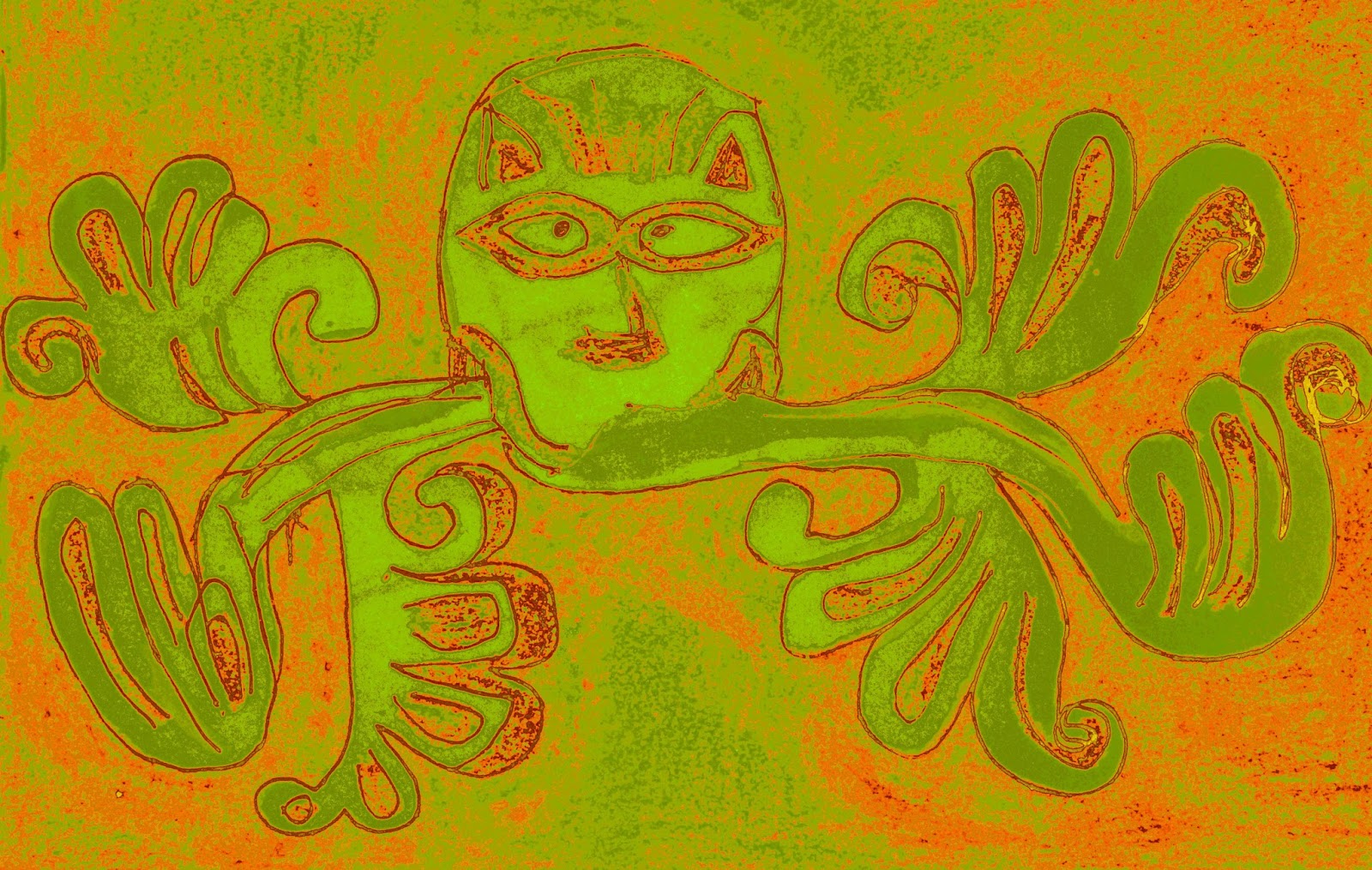
Here's the tympanum as captured by John Salmon.
There's our favourite, the Lamb of God, in the centre, with his little leg bent round cutely to support his pole with the cross. The cutely bent horizontal leg seems to be a diagnostic Romanesque feature.  He's also got some kind of radiating nimbus thing going on, but without any circular halo. Flanking him is the winged ox and leggy eagle of (I imagine) the evangelists. Not to mention more animals with tucked-under tails, plenty of patterns, a bit of planty swirlyness. The stones supporting the tympanum are serpenty and planty. Even the chevrons over the top are obviously excellent - they're single stones smoothed into a 3-d shape in a most satisfying fashion. The tympanum is in three parts but they seem different colours, almost as though it's not been broken accidentally but were always separate. Though that would seem a bit odd, given the strange angle. But who knows.

Inside, there's more Norman goodness. It's even said that the planty paintings on the walls are original, which seems quite crazy but perhaps it's true. What took my eye though was the sculptural goodness of the curious tapering small font. It's carved with two animals - one is a wormy tailed wyvern with two little front legs and wings. He's biting the tucked-under tail of the animal in front of him. I originally assumed that one would be a dragon but he's apparently four legs and a tail, and perhaps more of a lion. He's spewing out foliage and does not look best pleased at his tail being nipped. The circular scene fitted nicely in my new long sketchbook:


From the NLS's amazing map website


This is the 6 inch 1884 map of the village. Sometimes I wonder if a little bit more prior research could be a good idea... we had no idea this Motte was here, so close to the church. It must surely explain something - maybe this spot wasn't so remote as it might appear. It's called 'Aston Tump' and the Scheduled Monument Record  says it was constructed in the 1130s - a timber castle. There's a stream which flows down the hill here, forms a little moat round the motte and then pops out by the church - we stood and watched the water so doubtless we'd have noticed the 6m high motte if only we'd been expecting it! Never mind. The CRSBI page for the church suggests the carvings are also from the 1130s. So that's rather interesting. I am treating myself to a copy of Thurlby's book on the Herefordshire school which they cite.

Saturday 31 October 2015

Southrop, Gloucestershire


The main attraction at Southrop surely has to be its amazing Norman carved font, with its symbolic human figures, lettering, buildings and detailed patterns. Perhaps I was overwhelmed by it, but I gave it a go. You'll notice that for once I was sensible and focused in on the detail. Even so, it didn't take long to find out the detail was pretty detailed. It's got that characteristic that we both like to seek out... that is, patterns that are repetitive, but slightly dissimilar in each repetition. Even in the tiny extract above you can see differences on the right and left (it's not just my careless drawing).

But I wasn't a huge fan of the carvings of figures. Maybe I'm just not used to them, as they're unusual and B and I both like the Romanesque classic flora and fauna and geometric forms. But the thing I didn't really appreciate was the violence. The carvings are supposed to be the Virtues overcoming the Vices. But I'm not sure it's very virtuous to go stabbing or thrashing or trampling people. And I always say everyone needs a vice, I'm not against vices per se. So I found the carvings a bit unpleasant and so didn't feel that inspired to draw them.


So there I am in a church with one of the fanciest Romanesque fonts in the area, and I don't really like it. In fact I'm more drawn to the capitals in the porch. Of which this is one. And it's got zigzags, swirls (volutes), round bits going into square bits, and those boudoir trifle biscuits at the bottom. That's more like it.

There was a nice bit of beading on the chancel pillars as well, with saltire crosses and a wheaty band - really rather simple and kind of Anglo-Saxonesque.


The font at Southrop is quite uncharacteristic of the sculpture we've seen before. Maybe Norman times were indeed full of knights slashing at each other but that's not the image one gets from toothy dragons and swirling foliage. I wonder whether the creator of the Southrop font was working to a brief or whether it was a topic they felt strongly about and got Really Into. Nearby Stanton Fitzwarren (scene of a visit last year foiled by a locked door) has a very similar font, doubtless by the same hand.

I think B may have taken photos of each 'window' of the font. I feel as though I should go through each one and try to analyse what they show. But it seems a little too unpleasant for now.

We'd had an excellent bright autumnal day in the Cotswolds in the Van, and it seemed a fitting final odyssey for the year.

Coln St Aldwyns, Gloucestershire


Oh how I love a nice dragonny headstop, and the church at Coln St Aldwyns (whilst being a bit Victorian and bland for the Romanesque connoisseur) has two excellent ones, which are considerately sheltered in the porch.

It's got a dog-style nose reminiscent of the top quality examples at Elkstone, Leonard Stanley, or our recent trip to Somerset's more distant Dinder. Its teeth are excellently large and bitey, and there's some good runkling along the nose and around the cheek. The ears are quite small and cute but it's got an intense expression in that eye. There was something strangely bumpy between the ears. I wondered if was a devilish horn, but I think there was only one of them... it was a little bit odd as the rest was so clearly carved.

There was another similar animal on the right-hand side of the door, which B drew. But as usual I was becoming a drained wimp with all the concentration of drawing the one above. This can be disappointing when the carvings are so excellent :)

Quenington, Gloucestershire

It's been getting noticeably difficult to draw on our last few excursions, what with dingy weather and shortening days. So B and I thought we'd make a final trip for the year to a few further-afield, but bound-to-be-good sites. I'd scribbled some notes on a bit of paper and we leapt into the Van. It always feels like more of an expedition if you take the Van.

Having arrived at Quenington, anticipation was high but we consumed some snacks to raise blood sugar for the drawing ahead. Nevertheless I was still confused when we stood outside the amazing doorway - weren't there supposed to be beakheads? Our favourites the beakheads?  The door was amazing though - absolutely huge and with so much decoration it was as if someone had gone a bit mad and couldn't stop adding to it.


There was too much to draw and I felt overwhelmed. I was rather taken by this foliage-spewing animal (a green animal as opposed to a green man, you might say). There were also some borders of big flowery designs:


As we read the information booklet from inside the church, I realised that there were beakheads after all. But they were around the doorway on the other side of the church. OMG there are TWO DOORWAYS?! We walked round to be met by an equally elaborate and quite crazy sight. How can one church have so much Romanesque marvellousness? It was entirely overwhelming. I could only draw a little more. You could come back here every day for a year. 
The tympanums (tympani?) both had human figures on them. But when faced with so many creatures and excellent patterns, who needs Romanesque people? I think I know where my current interests lie (and this was confirmed later at Southrop).


Saturday 24 October 2015

Swainswick, North-East Somerset

The church at Charlcombe was St Mary's, that at Langridge is St Mary Magdalene, and finally we were at Swainswick - also St Mary's for some reason. A clutch of Mary dedicated churches. Swainswick church is much bigger than the other two and feels divided into sections - the chancel, the nave, a bit under the tower, the Kitchen, the chapel... it had an unusual feel but a friendly feel. Visitors were urged to make themselves a cup of tea, and that was a very kind proposition I thought.

The Thing at Swainswick seems to be carved faces. There were two Norman ones as headstops on the bechevroned / saltire crossed doorway arch. There were also some inside around the foot of the tower, but they looked more recent (something to do with their beardy style made me think this).


The left headstop has an enigmatic expression, but the right hand one isn't sitting on the fence - he's blatantly sticking his tongue out between his teeth (not an easy expression to achieve, if you try and pull it yourself). They've both got wide flat noses, which were rather reminiscent of a carved head now in the chapel. This was apparently found in the churchyard at some point. It looks rather enigmatic as well. It's very simple, staring straight out. I can't help thinking of Celtic Heads and Anne Ross. But who knows what age it is.


Also in the chapel was a floor slab in memory of John Wood the Elder, no less than the creator of The Circus and the mineral water hospital in Bath (the Crescent was the work of his son). I thought it was rather illustrative of the nature of life and death that this famous architect should wind up with a rolled-up carpet on top of his grave. I toyed with moving the carpet but B was more stoical and hurried me on. He's not even there, she said.


Langridge, North-East Somerset

Langridge church is home to something rather special: a carving of Mary and the Baby(ish) Jesus which sadly has been literally de-faced. We could immediately see similarities with the carving in Inglesham's amazing time-warp church. But it was raining hard outside and even with the lights on, it was dingy. With the panel high up over the chevrony chancel arch, neither of us felt up to the eye-squinting and neck-aching that would be required to draw it. I kind of regret that now, though a revisit could be made in future.

Because of the low light levels I couldn't take a very good photo. You can see one from the 19th century on the Bath in Time website. They claim the copyright's theirs but I'm inclined to say that's piffle.. if it's still anyone's it's the photographer's family. But there we are, to avoid aggravation I'm not going to pinch it. The carving looks in the same spot as it is now, just that now the surrounding wall has been plastered.

I regret the soft warm light in the church is not reflected by this hideously harsh flash-lit shot.

Carving guru Rosemary Cramp writes that it was found originally in 1827 'in a rough niche in the north wall' and that local tradition in 1995 had it that it'd originally come from 'a chapel or chantry, the remains of which are now part of a farmhouse, which is on Lansdown just above the road leading through Langridge.' It sounds like the same place as frequented by the St Alphege well pilgrims!

But that may be just local lore... what does Ms Cramp have to say about the carvings as they are? That Jesus sits on the Virgin's left knee, and that he's got a book in his left hand: I'm agreeable with those ideas. She also says his right hand is raised in blessing with two fingers up. That's would be like the Inglesham one. To me though, it's not obvious if that's what he's doing. In fact B immediately called the carving 'Graduation Jesus' because he looks like he's wearing a mortar board and waving a rolled-up certificate. I can't really see this two-fingered business (especially sat here at home with a dingy photo to look at).

Mary's a bit different to Inglesham too. You can see her feet, which is not something you can see on the Inglesham carving where she's twisted sideways. She's got one hand round Jesus (that's very clear) and the other hand... again I can't tell what's going on. Ms Cramp says she's holding an object up, perhaps an orb (this feature is seen in similar panels). I'm not so sure, I even wonder if her other hand isn't going behind Jesus. It needs a closer look really.

Either Mary has lots of hair or a scarf over her head, and Jesus (rather than a mortar board) probably had a great big halo. But the faces of both of them have gone, presumably hacked off by idiots. Hacking off the faces of saints is one thing, assuming you don't like people praying to them and suchlike. But it seems like going too far to want to desecrate an image of your saviour and his mother. I don't know, religious fanatics. No sense of aesthetics or that anything might be important beyond their narrow view of the world...

A lot of effort went into carving the garments they're wearing - there are lots of folds and traces of paint remain even now  - you can see the latter on my photo (despite its faults).

Mr P thought it was 13th century, but Ms Cramp feels there's a lot to make it pre-Conquest, which would be pretty exciting. "Devotion to the virgin increased in late Anglo-Saxon England" and then "there is increasing emphasis on her power as a mediator, not just her tender acceptance of the motherhood of Christ." So Ms Cramp says 'this impressive piece' could be from the first half of the eleventh century, and may once have been housed in a (possibly female) monastic house. However old it is, it is rather good.


In the porch the door is flanked by two spiral columns with scallopy capitals. This one on the right had a bit of extra carving in the centre. I liked the way even the left and right had side of that single capital differed! There's a photo of the entire zigzaggy doorway on British Listed Buildings.

Here's another interesting thing we noticed at Langridge. I was looking at the superb chancel arch, it's got 3D chevronage in all directions (again, you can see a picture on British Listed Buildings). At the ends of such chancel arches, you often get a head stop. We've seen dragons used quite frequently - indeed we saw the ones at Dinder the other day which were probably head stops.

So I was interested to observe this:


Look at that, it's been shaped and carved into a pointy end with long lines. I'm going to invent my own term here, I'm going to call it a ProtoDragon. Because it looks the world to me like the lines of the mouths of dragons we've seen elsewhere. I was very interested to spot this. There was one on either side of the arch.


And at the foot of the pillars of the chancel arch were fancy feet, reminiscent of the design we saw on our last trip to Old Holcombe, with 'toes'.

There's much more to be interested in at Langridge, but this is already long enough for one post I think.


St Alphege's Well, North-East Somerset


In my pursuit of mosses and liverworts from springs, I decided that our next stop would be St Alphege's well, just under the crest of Lansdown. It was pouring with rain by now, that really wet sort that makes your hair stick to your face. I should have known better as I dragged poor B down the road in her Mediterranean puffer jacket and fashionable boots. But I had a vague recollection of coming here a long time ago and it being easy to find. Oh poor memory. We were soon faced with a gate saying 'private', a sight I always associate with angry shotgun-wielding farmers. I'm sure the people who live here are very nice but the pouring rain put me off walking up the very long drive to find out. In addition, as soon as I crossed the boundary, seven pairs of extremely curious eyes were immediately fastened on me - seven alpacas craning their long necks at the ridiculous sight of a soaked human being. I gave up pathetically, though I did find the little ditch where the water from the well runs down the hill.

I found the photo above in the aforementioned Proceedings and I do remember the little door from my visit over ten years ago. But further pursuit of this site must wait. If the trough in front still exists, I'm hoping it'll be home to some mosses.

In my defence of its inclusion, St Alphege was of the same era as the focus of this blog. He was supposed to have been born in Weston (below the hill of the well) and met an unpleasant end in 1012. But then you don't get to be a saint by avoiding unpleasant ends. The Proceedings say "A quarter of a mile from the well ... is Chapel Farm. This was originally St. Laurence's Hospice for pilgrims on the road to Glastonbury. It is not uncommon to find a Holy Well by a frequented pilgrim track, and this is a good example."  And I see St A. spent time at Deerhurst in Gloucestershire, which is home to a super-swirly font which I'm keen to see one day.

Charlcombe, North-East Somerset


Charlcombe font was such a treat. I've not really captured the niceness of its shape very well, which you can see better in this photograph from a hundred years ago. It's very goblet-y, and the decoration nestles irregularly around the base of the bowl in a very pleasing way.


In my defence it was immensely dark in this lovely little church. We have discovered one of the difficulties with wintery drawing tours - there isn't enough light. The churches today did have lights, but they seemed to be keeping some of them to themselves, the switches were nowhere in sight. I suppose they don't want random visitors switching on all the lights and then pissing off. At our first stop here in Charlcombe there were a couple on a timer which periodically plunged us into darkness. And I mean darkness, if we hadn't had the door open we'd have been scrabbling about in a ridiculous fashion.

I'm not really complaining though as this place was superb. B was extremely taken with the way the font bowl and base had been carved from the same lump of stone, so the pleasing overall shape was how it was always intended (we don't see that as often as you'd think).

The carved decoration ran all the way round the bowl, but it was particularly embellished facing the doorway. The petal-like design featured in some places what I can only interpret as mushrooms. That might not be what was in the mind of the carver but that's what they look like to me.


The location of this church is superb as well. I'd remembered it being closer to the road but it's actually raised up on the side of the valley, and below it is something very peaceful and special, a spring. The field below the church, in which it arises, has been kept as a garden, and as well as all the delicious mossiness and liverwortiness of the spring, there was a superb twisted ancient tree simply covered in lichens. I was delighted to see a tiny sprig of Usnea which surely only likes properly fresh air - amazing considering the proximity to Bath and its interminable traffic jams.

There seems no point in including my photo of the holy well - although our eyes were adjusted to the gloom, the camera was having none of it and I didn't have a tripod to hold it still. The result is virtual blackness.

Here's an extract about it from the Proceedings of the Bath and District Branch of the Somersetshire Archaeological and Natural History Society for 1909-1913.
"Mr. Grey ... tells me he has known of this one, under the name of St. Mary's Well, for a great number of years. It is close to the old Norman Church at Charlcombe, in the Rectory garden, amid a clump of ferns. The inhabitants have a tradition that the water is good for the eyes, and some twenty years ago persons were known to come and take it away in bottles. It is also stated to be a "wishing well," and I believe the water is still taken from this source for baptisms. Mr. Grey gives an extract from a letter in which the writer states that a lady derived considerable benefit from this well, through applying the water to her eyes."

I suppose it's natural that our interest in fonts should be given an extra boost when there's a holy well in the vicinity that would have been used to fill that font. That's a pretty cool thought.


And as an erstwhile student of literature, I'm sure it gave B an extra smile to think that Henry Fielding was married here, and Jane Austen visited here.

The south doorway had some extreme trumpetyness going on, but I wasn't sure how truly old it was (it was very neat), and the north doorway is also alleged to be Norman. However, we couldn't see that one because a little room had been tacked onto the church to the north.

John Collinson wrote in his History of Somerset that "the common tradition is that it was the mother church to Bath, and that the abbey used to pay it annually a pound of pepper by way of acknowledgment." That may or may not be true but it's a fun thought. It's certainly a very ancient church (and has a more ancient look than the rebuilt Abbey).

Saturday 17 October 2015

Leigh upon Mendip, Somerset


Recently I've been aware I've been admiring the Organic Forms of our lovely Norman fonts. You may think it mad but I've been known to give them a little pat, because they're so solid and rounded.

But this one... well the official description is that it's scalloped. But let's face it, it has definite bum-like qualities. This is not a bad thing. And surely this couldn't have been lost on the sculptors.

"What would you like for your font then?"
"Well I don't know really, what can you do?"
"I've been doing a very nice line in Scallops recently. You could go for lots of scallops, or maybe just the simple version and have just a few."
"Oh yes let's go for the few then."
"Ooh yes I've got just the thing in mind. (Heh heh)."
"??"
"Nothing, nothing. I'll send you the invoice in due course."

When we first came in I thought the design was straightforwardly square with two scallops per side. But at the corners, when you ducked down and looked carefully underneath, you saw it's got a kind of concentric chevron thing going on. And that added a special touch I thought.

The rim was a bit bashed - the usual result of presumably removing the lock which was once added to it. The cover, in depressingly predictable fashion, was fairly vile.

But it's nice that the base is round, contrasting with the square bowl. It was definitely another pleasing font.

Holcombe Old Church, Somerset

Holcombe Old Church is in the sort of place we like, i.e. it's at the end of a long and winding narrow lane following a sudden handbrake turn off the main road. It's signposted too, making a useful and pleasant change.

Mr P. mentions the Norman carvings of the doorway, but I'd also read of the church in Rosemary Cramp's book on Anglo Saxon carving in South West England ( you can read the relevant section here at the moment). That's because a part of the stone that makes up the right hand capital (which you see below) is inscribed with letters. You can be pretty sure it's reused rather than contemporary with the capital, because the writing is upside down for one thing.


The lettering has a definite Style to it. Cramp says "The letters are boldly but unevenly incised, and some letters are finished with serifs or the expansion and deepening of terminals." By which you may infer that it shows an individual's hand, but they've gone to a bit of trouble to make it look fancy.

I was going to draw it but I was getting tired and the light wasn't very good for picking out the details. I took a crayon rubbing of a bit instead. Yes yes I thought about the frowns I might get for this (you'd certainly get frowns if it were prehistoric rock art). But I've done it now and here is the little bit I did:


There's much conjecture about what the whole thing says (or said) - it's probably in Latin but a lot of letters are missing. And it's suggested 'PROT' could be at the beginning of the inscription because it's apparently preceded by a little cross. Or at least, it's the first line that survived (now the lowest since it's upside down). Cramp has the lettering transcribed as follows:

[+P]ROT[R] ---
--- AT [...]
EIE [L.]A[V]--
C:PET[R]A[.]--

It's sad that I'm not organised enough to be able to vouch for any more than the PROT. But I'd like to defend myself by saying that I like the element of surprise and also that I don't want my mind to be influenced by prior knowledge. With lettering, you might decipher it in a certain way because you are expecting it to say something particular. And with carvings more generally, you might be inclined to See what you're told to see, and even miss things that you haven't been told about.

More concise information can also be found Lapidge's 'Anglo Saxon England v21'.

But lettering is never really as exciting to draw as a lovely spiral column with fancy Romanesque capital. And those spirals are a treat in their unevenness. I like the way the blocks aren't evenly sized and the stripes don't match up properly, and they even change direction. Is that because someone moved them and put them back together weirdly? Wouldn't that have been somewhat lazy? I like to think they how they were intended. But who knows.

Another strange thing to note about the columns is the curious beaky toe on each one. I think we've seen similar things before (maybe Marden?) - but maybe not just single ones like that.

Chesterblade, Somerset

Chesterblade is very little and the roads are narrow. But as I tried to abandon the car in an inappropriate spot, a very nice woman offered me the use of her driveway. This was very kind. I might have given her a funny impression with my pleading 'oh I just want to see the church'. But it was the truth, albeit not inspired by religious sentiment.

Here's the font. It was plain but pleasing, like a giant beaker, or a clay pot that had been made on a wheel. And of course, slightly wonky. It was sitting skewhiff on its unevenly shaped base. And it had a nice simple cover, none of that fancy tasteless business.


I read the blurb in the church leaflet about it and it was very strange. The back cover featured an alleged drawing of the font, and it had a band of twisted rope design around it about two-thirds of the way down. The leaflet explained how an Artist in the 1840s had drawn it so, but later the design had been removed. Youwhat? There was not a trace on the font to suggest any such vandalism had taken place, it was smooth and lovely. It seemed to make no sense at all. That someone would go to such trouble to remove a totally inoffensive design, and then go to extreme lengths to make it look perfectly smooth - yet (and here's my clincher) - do a completely botched job on the place where the lock used to be at the top. Not to mention to then sit it wonkily on a funny shaped base? So. Frankly, I don't believe a word of it. It certainly gives the impression of being in its original form.

It's true to say that B and I not infrequently get confused about names and what was where and when. We try to label our drawings as soon as we've done them, whilst still in the church. Even then, we're sometimes asking ourselves 'hang on, where are we again?'. And that's with maps and Pevsner and the internet and everything. It doesn't seem unbelievable to me that the 1840s artist had a big sheaf of drawings and got confused about which came from where, and mislabelled one of them.

That's my opinion anyway.


Outside in the porch were two super capitals, the chubby face above (with ears and beaded eyebrows) and the lovely to draw twiddly design below.


There were also two creatures at the headstops of the arch. But I thought they were very cramped as they were very small, unusually small in our experience of such things. You can see pictures on the CRSBI website. I wasn't taken with them. They don't look Romanesque to me, but I shouldn't argue with the CRSBI should I.

Also on that page you can see photos of some carvings we totally missed. We're usually quite thorough and have a stroll round the outside of the buildings. But we must be getting slack to miss not one but two carvings with faces and animals. B will be saddened to hear that one of them was a Lamb of God (you can tell by the characteristically bent front leg, which usually supports a cross). They haven't quite got that bold touch that I like. But I'd still like to have noticed them! Maybe another time (pending parking opportunities). There's a photo of the other carved stone here.

Doulting, Somerset


There's not much at the church in Doulting that speaks of great age, other than the two capitals on the north door. And they were very nice albeit simple. Unmatching, of course (and just how I like it). The left one now reminds me of something I saw Mary Berry and her sidekick make on the tv the other day (a passionfruit and lime charlotte russe). The right hand side design has an organic foliate feel. Perhaps it echoes something of the amazing liverworts we were to see imminently.

Because coming out of the hillside below the church is St Aldhelm's Well, a holy spring. It's only a short walk, along a be-treed path and between stone walls down a steep lane.

CC image by Kerryn
I wanted to visit it especially to check out the mosses and liverworts there. Which were lush and rife, and much squealing was heard. The water was so clear and cold, and the noise of it splashing down out of the big stone trough was so continuous and soothing. It was just a superb spot. I felt invigorated by being there.

People were filling big water containers and carting them away in their cars, presumably to Benefit from its springyness and sanctity. So I figured the water couldn't be that full of nasties. B and I both took a mouthful. It certainly had its own taste, but it was hard to say of what.

Dinder, Somerset


It seems that dragons are well known in Dinder. There's a local legend about the Worminster Dragon or Worminster Worm. 

This issue of Dragonlore gives some details from an account in the Wells Journal. "During the 1200s, Dulcote, Dinder and North Wootton were troubled by a dragon living at Worminster Sleight, who breathed fire, scorching fields, trees and sheep. The people called on the Bishop of Bath and Wells, Bishop Jocelyn, for help, and he rode out alone to find the beast. The details of his confrontation vary depending on who tells the story. Some say he killed the dragon with a lance, others maintain he struck it down with his bare hands. In either case the dragon ended up dead  - but the story doesn't end there. It seems that before it breathed its last it bestowed a curse and if the villagers ever forgot about the monster it would be able to return to life, and its chance for reincarnation would come every 50 years."

So every 50 years the villagers have to do something Dragony, and the last time was in Dinder in 2001, when a giant model dragon was paraded around and then set on fire.

But I've seen no connection made (on the internet at least) between the carved creature above and the dragon. The lovely carved creature is actually two animal heads, joined by a short length of zigzag / balled arch-iness, and it sits high up in the chancel in Dinder's church. The friendly woman who was cleaning the church went we arrived, pointed out that the stained glass window below it featured St Michael, the patron saint of the church, as if to highlight the importance of both.

B and I were not convinced of their dragonyness (much to the surprise of the aforementioned woman) - largely due to their very doglike noses. The noses were really very well observed. Whereas you'd imagine dragons would have lovely flaring nostrils. Admittedly, dogs do not have a row of little pellets down the middle of their heads. And the ears of these creatures are remarkably long. Yes they do indeed look like some of the other dragon heads we've seen elsewhere. It seemed clear to us that originally the two would have been headstops on a door or chancel arch - at least, that's where we've seen such things before, and they must have been saved and reused. And they're very nice, so why wouldn't you.

Here's a mosaic of the Other dragon created by Kate Rattray - it's near the bishop's palace in Wells.

CC image by Frankly PM
Bishop Jocelyn (or Jocelin) was indeed around in the 12th century. So that's kind of interesting that that's the same period as our lovely Romanesque carvings.

The only picture I can find on the internet of the carvings are on this rather eccentric website which tries to connect it with ley lines. Well if that's what floats your boat, we all have our niche interests don't we.

Saturday 3 October 2015

Patney, Wiltshire

Mr Pevsner must have been in a tremendous rush at least a lot of the time - or how would he ever have written all those books. Sometimes he's very laconic in his font descriptions, and sometimes he doesn't mention them at all. So I'm always on the lookout for alternative sources of Leads.

I was reading 'Some Wiltshire Fonts' by A G Randle Buck (surely a man after B and my hearts) and he mentioned the one at Patney, just near Devizes. "Similar to the one at Stockton, and over the junction of the scallops is a curl ornament." - he also mentions similarities to the one I've seen at Yatesbury. So it sounds lovely, how could one refuse.

We parked nearby and set off up armed with the usual materials and clutching Pevsner (I like to think it makes us look more legit).

CC image by Nigel Cox.
I noticed nothing at the gate, but as we walked through the graveyard I started vaguely thinking 'well how nice, someone's gone to the trouble of looking after lots of little plants in plant pots'. Like B it was only when the shape of a lampstand in one of the transparent windows made its way slowly into my brain, that I computed the evidence - someone had bought the church and turned it into a house. We hot-footed it away.

In retrospect I suppose we could have experimentally banged on the door - I doubt they get a lot of visitors wanting to draw the font. I do hope they've still got it and are looking after it. I can't find a photo of it.

I kept thinking afterwards was that it would be a right pain to mow round all the gravestones. To be fair the churchyard was extremely well-kept :)

Etchilhampton, Wiltshire

We'd come to visit the Norman font. There's a drawing on this page of the WANHM journal but it doesn't really do the scallopyness around the bottom justice - it's a bit more complicated than that. I can appreciate it was difficult to draw though because mine isn't right either. There's a kind of double thing that should be going on. You can see much better on the photo on B's blog.


It's definitely been given a new round base since that drawing in the journal. The 'top base' (if that makes any sense at all) is definitely wonky, which of course I appreciate. There was also a little cross scratched in, and I think the round mark I've drawn was an indication of where the lock used to be. I'm starting to realise that the hacked-aboutness of a missing lock does at least affirm the great age of the font.

On another note, if there's something that really winds up my O.H., it's place names that aren't pronounced the way you'd expect. According to another ancient volume of the WANHM, Etchilhampton is 'Ashelton'. That was 1867 though and perhaps things are different now, who knows. There was a man mowing his lawn and I was going to ask him about the clouds of mining bees that were inhabiting the verge next to where we parked. But he didn't look like he wanted to talk to Strangers. I don't even think we look that dodgy.

Devizes, Wiltshire

Toothy creature on the corbel table. CC photo by Brian Robert Marshall.

I was looking forward to the wealth of Romanesque amazingness at St John's in the middle of Devizes. We've been here before but I hadn't indoctrinated B properly at that point, so as we walked up to the church she denied any recollection of the sculptural goodness inside. I was looking forward to showing her, and being able to draw something a bit more satisfying than the Fake Font at Bratton.

But, as I rattled every damn doorhandle into the building, it became obvious that we weren't going to get in.

It was a replay of our trip to Amesbury. And I just want to ask WHY??

It's harvest festival this weekend. And I know I'm an atheist. And I just want to admire the carvings and put a bit of cash in the collecting box. But what about religious people? Or even casually non-committal, come to church every now and again types? What if they want to come in for a quick pray? A bit of god-based solace? Just a sit down?!

Why are we being locked out of a church in the middle of a town on a busy Saturday lunchtime?! When little churches in the middle of nowhere can be unlocked for visitors, why can't a massive church like St John's?

It completely bemuses me and it annoyed me at the time. B thought it was annoying me completely out of proportion to what was necessary. But then she didn't know what she was missing. Well B what do you think of this? And there's more curious creatures on the corbels (hence my irritation at forgetting the binoculars). Some people have looked at them very closely, as detailed in this WANHS article. 

Don't worry, I'm over it now.

Bratton, Wiltshire

Photo by Rog Frost

Bratton church was in a strange sort of place. If you want to get to it you can either follow a long road from the other end of the village, or take a path which involves going down and then up these amazing steps. I was very taken with the steps. I don't understand why there aren't lots of photos of them on the internet. They have an ancient mossy air. I hope B took a photo I can borrow, because they don't look like anything much on that link. But in reality they were really something special.

I have to research and write a dissertation over the next year, and I've kind of decided it should be on the mosses that grow at springs in Wiltshire. It's a bit of a vague concept at present. And today was my first practical step into the idea. So where the steps at Bratton church stop going down and start going up again, there's a little stream, and donning some wellingtons I paddled my way towards its source. The site is called 'Church Springs' unsurprisingly. I collected some mosses but it made me realise my little idea isn't going to be as straightforward as I'd hoped.

But moving on from the bryology, what better spot could one have for church sculpture visit? Sadly, the church wasn't exactly replete with Romanesque interest. Someone had written that the carved heads on the outside of the porch were Saxon. Yeah right I Doubt It (scroll down), and I don't think we've ever seen such a Saxon thing as a carved head, it's usually knotwork. Wishful thinking eh. This might be tied up with the wishful thought that the church is there because of the springs, a continuation of pagan respect for them. But probably it's there rather because the village was there, and that was there because of the springs. Because you have to have water don't you. Respect can come from that of course, and the Church Springs are said to be unfailing (that's the kind of spring you want).

The font inside was evidently Norman style, but it was so neat and even that it didn't look old, and Pevsner called it 'recut'. It's a nice design (there's a picture here) but it didn't have that wonky vibe that the Romanesque Carving Fan craves.


Monday 28 September 2015

Lullington, Somerset


We've not been to Lullington for ages, but I was flicking through a book this evening and a photo I'd taken there fell out. So I thought it would be a good stress-reducing plan to draw from it. Our last trip out didn't include as much drawing as it might.

So here are three of the amazing beakheads that surround the elaborate doorway (illustrated here).

The carver must have really enjoyed making the creatures' mouths curl round the roll in front of them - they've often made much of their wrinkled upper lips!

You can't beat a good beakhead but it's the way the carvers usually surrounded an entire arch with them, making each one different, that makes them worth travelling a long way to see.

It seems that Wiltshire's not very replete with them. Only Chirton springs to mind right now. Otherwise, the ones we've seen have mostly been in Gloucestershire.

Saturday 19 September 2015

Orcheston, Wiltshire

With all the traffic trying to avoid the closed Shrewton to Tilshead road there was some chaos round here. But we eventually found St George's church. It's under the care of the Church Conservation Trust. It was raining quite hard now, and inside the church felt dingy and cold, so I probably wasn't as receptive to it as I might have been. Then we discovered that the very doorway we'd come to see (admittedly, probably quite a simple Norman doorway with straightforward scallopy columns) was locked away in a slightly undignified way with the lawnmower in the north porch. Oh well.

They seem to to have been everywhere, so I'm grateful to Duncan and Mandy and their website for this photo of the things that most caught my eye at Orcheston - this toothy carved creature (bat?) and his manically grinning portly pal.


Wednesday 16 September 2015

Durrington, Wiltshire

I wasn't sure how much I believed in the ancientness of Durrington. Mostly, not a lot, because it was evidently one of those messed-with churches sporting Neo-Norman carvings inside (for example, the bases of the chancel arch). It did have some of the stripey white and green greenstone chunky nave columns though (right hand side only) and I liked those.


Outside, a Norman doorway was promised. But I didn't feel wholly certain about that either. Mr Pevsner and B were happy with it. But I feel a bit funny about the symmetricalness of the columns. They're awfully even and they were the same on either side of the door. Which seems unusual.


To be fair, they were worn. But are they the right stone? Aren't they very yellow? And shouldn't they match the capital above? Perhaps so, perhaps not. I think I approved of the capitals though. Suitably non-matching. But I don't think I have a photo of the left hand one (much more eroded). And there's a decided lack of any photos at all on the internet curiously.


And here, the scales over the doorway. But as the doorway probably wasn't there in the first place, it doesn't seem likely that the scales would miraculously fit in the space above. So I don't think I believe in their oldness either. But here they are anyway. So very, very even. Hmmm.


And it was raining quite hard by the time we got here. So that didn't help either.

Figheldean, Wiltshire

People who have dogs tell me that their pets provide other people a conversational opener, an excuse to start talking to a stranger. And that's a nice thing for us British. I think I've found my dog substitute - a massive purple sketchbook, first outing today. At Figheldean church not one but two people spoke to us as a result, and then someone else turned up too. The building's obviously well used for its original purpose.

We heathens had come to see the carved knights lying either side in the porch, although they were slightly obscured by some very jolly boards covered in colourful magnetic letters advertising the latest goings-on. Encouraged by our enthusiasm for the knights, we were given a kind and very comprehensive tour of the church by one of its custodians. It was interesting to see some greenstone in the columns (photo here though the columns are quite incidental to the photographer's intentions :)


But Figheldean is one of those churches that's been very messed about with, and there's even some neoNormanness going on. So its main attraction for us was the knights. Our guide surprised us by explaining they'd been dug up in a nearby field - perhaps hidden there during Cromwell's time, he speculated.


None seem to be able to compare with the lovely knight at Castle Combe. But these are the second-best we've seen! The cute little dogs / lions at their feet are well carved, with excellent paws (though the right hand one has been reassembled facing the wrong way). One knight has deeply carved folds in what I assume is a cloak. The other looks very comfy on his pillow. It would have been cool to have more chance to look at the pair closely, do a bit of drawing, take some photos without the magnetic letters in the way. But never mind.


It was also instructive to overhear the correct pronounciation of the village name - Fyaldene. I'd have been calling it Figgledene for ever more.

You'd think photos and stories about these knights would be all over the internet. But they're not. I think they should be. These knights are great.

I found some mention of them in John Aubrey's Topographical Collections of Wiltshire. He says:

FIGHELDEN.
Near the Belfre, in the South Aisle, are two fair freestone monuments of Knights crosse-legged, with shields, and at the feet of each is a Lyon. I could not learn whose Monuments they were: they are tumbled now, 1671, one on the top of the other. 

 Underneath in that edition, written in 1862, it says: "These effigies, having received some injury in their horizontal position, were for some time placed erect in the chancel: but have lately been restored to the place in which Aubrey saw them.

Pevsner says they're 'probably late 13th century'. But he also says one of the knight's pillows is supported by angels. I can't see it myself from the photos. Perhaps we need a closer relook.


Fittleton, Wiltshire

Fittleton was only a short way from Netheravon so we thought we'd better pop in and check out the font. Mr P had been typically laconic (Circular, Norman, with plain sunk panels).

It is plain, but surprisingly chunky. It kind of gave the impression of being massive. But it's not massive, just looks really sturdy.

This is my drawing. But it's not quite the right proportions, somehow I managed to make it too long and thin. I tried again. The same thing happened.


This is how it looks to a camera (courtesy of B):


As I was looking for information online, I found that someone else had also had Font Trouble. This page purports to show a variety of Wiltshire fonts - the top right corner is Fittleton. John Buckler was no amateur artist. Richard Colt Hoare (of Stourhead and antiquarian pursuits) paid him to draw lots of church architecture around Wiltshire (and beyond), around 1800. So it's fun to think he was trailing round with his pens to many of the places we've been ourselves some two centuries later. But! you will see that his version of Fittleton Font also suffers the same affliction - too thin through. I feel better. Mr Buckler must have been a busy busy man. And he was certainly a better draughtsman than I am. But maybe something about the Font at Fittleton makes you draw it funny. Who knows.

B noticed some light carving on the raised bands. It also seems to have quite a few chips like it's been ill-treated. At least it seems to have been given a sturdy new base.


Elsewhere on the web it's suggested that the corbels holding up the roof are late Norman. But if the rest of them look anything like this then that's pretty late. About as late as My Eye, I'd say.

Netheravon, Wiltshire

The last couple of trips, B and I have arrived at the location most dripping with Romanesque goodness as the last of our stops. And this is not conducive to drawing owing to mental and physical exhaustion. So this time we decided we would go to the most promising place first(ish). This was a good idea, except it started to rain. I could have stayed here a lot lot longer.

It's immediately obvious that you're somewhere different - the tower of the church is very unusual looking (well, certainly for this neck of the woods). I must credit Duncan and Mandy's website again for the photo below.


Anglo-Saxonness abounds. I really loved the fantastic little doorways that opened into the north and south of the tower. I'm hoping B will provide me with photos of these. The stone was beautifully coloured, peachy and orange and sand. If it hadn't started raining I'd have cheerfully painted these doorways. Originally the tower had been central in the church, and you could see where other walls had adjoined it.

On the west end of the tower were large doors, and these were framed by deliciously carved capitals on tall plain columns. They were superb. I drew only one but there were four.


The Quadruped (with classic tail between legs pose) has unfortunately lost its face to weathering. But much of the rest of the carving was fresh and tactile. The colours were warm and very appealing. They weren't necessarily part of the stone though - B's suspicions were confirmed when I geekily got out my hand lens and we squinted at the wall - red lichen.

I suppose the columns may have been moved or carved when the tower was rejigged? How old are the carvings? The tail-through-leg may have started early I guess. There's lots of speculation (and considered deep thought I'm sure) about the church's structure on the Anglo-Saxon-Churches website.

Inside, walking through the tiny south doorway, the tower soared up, with a superb round arch and tall tall columns into the nave. This was really something special. I liked it here a lot.

from Duncan and Mandy's website

Shrewton, Wiltshire

We wandered around a bit in Shrewton. That's because Maddington St Mary's is in the middle of Shrewton. And Shrewton St Mary's seems to be in Maddington. I can't begin to explain this. Perhaps I'm wrong. Today was quite a strange day. It might have been the weather (oppressive), my mood (peculiar) or the incessant guns going off on Salisbury Plain (like being in a war zone).

Shrewton looked old from the outside. But inside we couldn't really be sure that anything we were looking at was genuinely old. The chancel arch capitals were the most convincing. But they looked too recent to be Norman.  The chunkiness of the nave columns looked okish - at least the green and white stripey one that you can see in Neil MacDougall's photo here, at the back of the church. (More greenstone, you'll notice, like in other relatively nearby churches we've been to recently). But the carving on them was so neat and had an unconvincing texture, so we didn't find any of the trumpetiness credible.

The font was definitely neo-Norman but really rather good. Mr P says it's by TH Wyatt, who's responsible for much of the rest of the church. But he did well there I think. It's got a liveliness about it and it's pretty chunky. Far too symmetrical for the connoisseur of the originals! but lively nonetheless.

Saturday 5 September 2015

Great Durnford, Wiltshire

In terms of Whoops Per Minute, Great Durnford turned out to be approaching the top of the league table. It has not one, but two Norman doorways with patterned tympanums. And inside, a stupendous font. And then - look at those weird carvings near the door jamb! And then! a big chancel arch with two crazy winged creatures. And on top of that, some swirly painting. And some absurdly ancient pews. It was all a bit much. There was much squealing. I also squealed a bit at the end when I saw a huge spider in the porch. But B assured me it was dead (as she quickly hurried me away).


This is the amazing font. The amount of work that must have been put into it is huge. But Mr Pevsner lets us down. This is his description: "Circular, Norman; short, primitive interlaced arches; band of volutes over." Mr Pevsner, really?? Is that the best you could have done? You didn't want to mention the little faces created by the design of the mini columns? The sheer number of arches? The fantastic swirliness of the Danish pastryesque designs around the top (which even put me in mind of the swirliest font in the world, the one at Deerhurst.. yet to be visited). Oh Mr Pevsner how tired you must have been not to have been more enthusiastic.


Here's the font in its natural habitat. We removed the cover. It was the most inappropriate and foul thing imaginable. If you've got a strong stomach you can see it in this photo by Rex Harris.  It's absurd, it looks like a silly hat. Yeah it's probably Jacobean. But that doesn't make it tasteful.


By the south door were these slightly crazy sea-anemone-like carvings. They reminded me of something similar at Lullington in Somerset. Those are over the doorway (and at its foot), which you can probably see better in this photo by Phajus. But they're not quite the same. I like the way these are different sizes from each other and a bit randomly spaced. The unevenness is just so appealing, so human.


The design looks properly folded over / pinched in (think Danish pastry again). To create something so organic out of a solid bit of stone is surely quite a feat. I don't know why they're down only one side of the door. I like them a lot. All this talk of food made me wonder if, since there are seven, if they were the seven loaves in the 'feeding of the 5000' (correction - there were 5 for the 5000 and 7 for the 4000. Who knew). But then where are the fishes? There are no fishes. So it's not that. Who'd pass over the chance to carve some fish. But maybe it doesn't need to be anything. Maybe trying to find Explanations For Everything is highly overrated (more of this in my Leominster ramblings).

Meanwhile either side of the chancel arch, perching on the roll at the bottom of each capital, are two creatures. One is very dovelike, but the one on the left isn't so easy to classify. It's got big (feathery?) wings just like its partner, and likewise three little toes on each foot cling to the capital, but it's not a bird. It sports a big cheesey grin, a fat tummy, and sticking-out ears. It might be tempting to see something naughty and impish in it, to contrast with the good dove opposite. But it doesn't look very naughty. Its eyes are outlined in a very nice Norman way: John Vigar has a photo here. He calls it an owl. I'm not sure about that though, they're not renowned for their smiles.


There's plenty more to be drawn from the photos B kindly took at Durnford. So I will do that soon.